")
Have you ever taken a close look at the 7-Eleven logo? At first glance, it seems simple and familiar, but there’s one small detail many people miss for years: the final “n” in “Eleven” is lowercase, while the rest of the letters are capitalized. It’s a tiny design choice, yet it has become one of the most talked-about quirks in branding history.
From Tote’m Stores to 7-Eleven
The company’s story began back in 1927 in Dallas, Texas, under the name “Tote’m Stores.” The idea was revolutionary for its time — giving customers a convenient place to pick up everyday essentials like milk, eggs, and bread without visiting several different shops. Shoppers could simply “tote” their groceries home, inspiring the original name.
In 1946, the business adopted the name 7-Eleven to highlight its extended operating hours. At a time when most stores closed early, staying open from 7 a.m. until 11 p.m. was considered highly convenient and modern. The new name quickly became part of the company’s identity.
Building an Iconic Logo
As the company expanded, it needed a logo that customers could recognize instantly. The bold number “7” paired with the word “Eleven” created a clean and memorable design. Bright red, orange, and green colors were chosen to help the stores stand out from a distance, especially along busy roads and city streets.
Over the years, the logo became one of the most recognizable symbols in retail. Whether seen in North America, Asia, or elsewhere around the world, customers immediately associate the design with convenience and quick service.
The Shift to 24-Hour Convenience
Today, many people connect 7-Eleven with being open all day and night, but that wasn’t always the case. The move toward 24-hour service reportedly began in 1963 at a location in Austin, Texas. During a busy football weekend, the store stayed open later than usual to meet customer demand. The extended hours proved successful, and more stores gradually followed the same model.
Even after becoming a 24/7 brand, the company kept the name 7-Eleven because it had already become globally recognized.
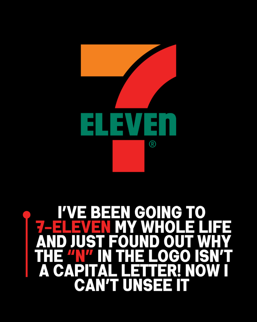
Why Is the “n” Lowercase?
The unusual lowercase “n” has sparked curiosity for decades. Early versions of the logo actually used all capital letters, but executives felt the design looked too stiff and overly aggressive. According to company history, the wife of President Joe C. Thompson Jr. suggested changing the final “N” to lowercase to give the logo a softer and friendlier appearance.
That single adjustment made the branding feel more welcoming and approachable. There was never a hidden meaning behind the lowercase letter — it was simply a thoughtful design decision that unexpectedly became iconic.
A Small Detail People Never Forget
Although the 7-Eleven logo has seen small updates through the years, its overall appearance has remained remarkably consistent. The famous number 7, the bright color combination, and even the lowercase “n” continue to make the brand instantly recognizable worldwide.
It’s proof that even the smallest design choices can leave a lasting impression. What seems like a tiny detail has become one of the most memorable parts of a logo recognized by millions every day.